


LaLiga is gearing up to host a unique retro fiesta next month in which most of the clubs in the Spain’s top flight will play in special throwback kits created especially for the occasion.
Fans will have to wait until the matchday spanning April 10-13 to see the retro jerseys worn on the pitch, but LaLiga had 17 of its 20 teams unveil the nostalgia-laden shirts this week at a special event at Madrid Fashion Week.
The designs are not intended to be direct replicas of the original shirts worn in years gone by, but rather new designs that are heavily inspired by the styles and trends that have graced Spanish football over the years.
Here is a first look at the various retro jerseys that were revealed on the catwalk, with clubs such as Atlético Madrid, Valencia, Villarreal and Barcelona (sort of) taking part in the fun.
– Stream every LaLiga match LIVE all season long on ESPN+ (U.S.)
– LaLiga Confidential: Spain’s soccer stars take ESPN’s player survey
– Messi’s 900th career goal: Can he reach 1,000? Can he pass Ronaldo?
Alaves’ jersey is a take on the shirt they wore in the epic UEFA Cup final of 2000-01 when the Spanish side were beaten 5-4 in extra time by Liverpool thanks to a golden goal (remember those?). A quarter of a century on, the club have revisited their unusual navy blue and yellow-banded livery from that fateful night with a shirt that has more than just a faint whiff of Boca Juniors about it.
The club from Bilbao has opted to draw inspiration from its classic kits of the early 1970s. The 2026 revamp is similarly straightforward and the white-out logos add to the pleasingly “heritage” aesthetic. Shame they had to leave that tacky sponsor on full display though.
Atléti have rolled things all the way back to 2022 in order to revisit the retro 120th-anniversary third kit they released in their original club colors of blue and white. The same half-and-half template has been reused, with former Rojiblancos midfielder Mario Suárez doing the honors on the runway.
It looks like Barça entered their design for inclusion at the 11th hour, in the somewhat underwhelming guise of last season’s home kit. They did win a domestic treble wearing it, but it hardly meets the definition of “retro.” Still, it’s a better effort than their LaLiga counterparts Getafe, Rayo Vallecano and bitter rivals Real Madrid, who are will not be offering any kind of throwback kit for this special round of fixtures.
This kit adds a whole new meaning to the retro” concept: the “A Reconquista” jersey features a red-and-white harlequin pattern that is a nod to the city’s flag, designed in tribute to the popular uprising against Napoleon’s army in 1809. The jersey will actually be worn when Celta play Alavés on Sunday, and will be brought out again for the retro matchday.
Formulaic stuff from Elche, who have resurrected their white and green kit from 1991-92, in which they finished fifth in the Segunda División. Unfortunately, the modern reissue lacks both the unusual V-neck collar and the cool central sponsor of its predecessor.
Espanyol have created one of the best of the bunch with their salute to the early 1990s. Much like their third shirt from 1992-93, the modern take comprises a vivid yellow design that sees the fabric stamped with a clover pattern to add era-appropriate texture. The rather ace oversized “Dani” sponsor logo caps things off nicely.
It doesn’t look as though an awful lot of effort has gone into Girona’s retro threads. The club is set to turn out in a fairly standard red-and-white-striped template shirt that looks like it could have been worn last season.
Cream with tonal logos and a large diagonal black sash across the front, Levante’s retro kit is a nod to the monochrome stripes worn by the club shortly after its formation in 1907. The result is a truly superb football shirt that somehow looks both contemporary and a century old.
The only LaLiga retro kit to be unashamedly informed by the early 2000s, Mallorca’s effort is dripping with post-millennium vibes. Nike have studiously replicated that “Total 90” look to herald a strong side that boasted the likes of Samuel Eto’o, Albert Riera and Walter Pandiani.
Ostensibly an ultra-plain red jersey that could stand in for any Osasuna home shirt of the last 35 years, the retro kit is apparently an ode to the legendary side of the late 1970s and early ’80s that played their way into the Spanish top flight after a 17-year absence. You’d have thought that might warrant a bit more of a celebration.
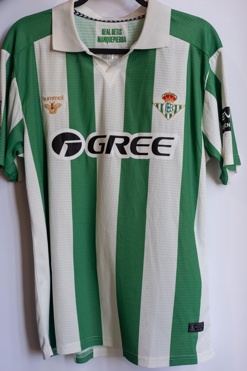
Betis definitely know their way around a retro-themed kit, having released dozens of lovely, classically styled jerseys in recent years. This particular design is intended to fold in four decades of history with classic bar stripes of the 1960s and 70s, a large folding collar from the 1980s and the embroidered club crest used in the 1990s. It’s easy on the eye, if not earth-shattering.
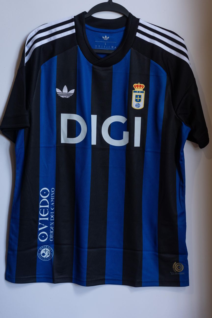
Oviedo have chosen to mimic the anniversary kit they released in 2017 to mark the club’s 91st anniversary, which saw a return to blue and black stripes. The trefoil emblem is a nice addition, as is the unorthodox asymmetric sponsor logo that is placed vertically in the bottom corner of the torso.
Absolutely magnificent stuff from Sociedad here, who have returned to the kits they wore during the final few seasons they spent playing at the historic Atotxa stadium, the club’s spiritual home for almost 80 years. The polo collar, ribbing and pattern on the trim bands just scream 1991-93 to us.
Another retro kit with that ever-popular trefoil branding, Sevilla have removed all clutter from their shirt and returned to their original home colors of white and chalky red, along with the circular “SFC” club crest they wore on their chest during the first two decades of the 20th century.
Inspired by the bright orange third kit worn by Los Che between 1990 and ’92, the modern variant retains the splashy “camo” style but loses some of the charm of the abstract brushstroke pattern that adorns the original.
Arguably the best of the lot, Villarreal have toned down their now-familiar bright yellow jersey to match the more muted tones they occasionally wore during the early 2000s — the era in which they really began to establish themselves as European competitors. It makes us instantly think of Juan Román Riquleme, and that can never be a bad thing.


